```html
Dyslexia affects millions of people worldwide, making reading a challenging task. For many, the choice of font can significantly impact readability and comprehension. Recent studies have pointed toward specific fonts designed to alleviate some of the struggles faced by individuals with dyslexia. In this article, we’ll explore the best fonts for dyslexia, why they are effective, and how they can change the reading experience for those affected.
1. OpenDyslexic: A Game Changer for Reading
OpenDyslexic is a font specifically created with the needs of dyslexic readers in mind. Developed by Abelardo Gonzalez in 2013, it features unique letter shapes and a heavier bottom, which helps guide the reader’s eye. The design is intended to prevent letter flipping and swapping, common issues faced by those with dyslexia.
What sets OpenDyslexic apart is its unique approach to letterforms. The font includes more space between letters and is generally wider, which helps in distinguishing similar-looking letters. These design choices enable easier tracking across lines of text, making reading less daunting and more fluid.
2. Dyslexie Font: Tailored for Clarity
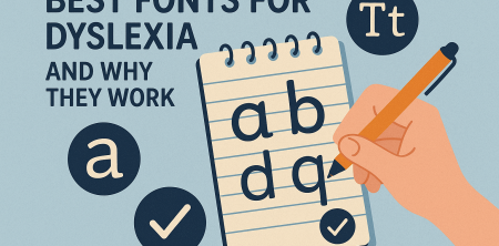
Dyslexie Font was created by Christian Boer, who has dyslexia himself. He designed this font to improve the reading experience by incorporating specific features that address common dyslexic challenges. The letters have varying heights and weights, which helps prevent confusion between similar characters. For instance, the letter 'b' and 'd' can often be mixed up, but the distinctive design of Dyslexie Font reduces this risk.
Research has shown that users of Dyslexie Font often report a significant improvement in reading speed and comprehension. The font’s overall aesthetic also provides a comforting and less intimidating visual experience, encouraging dyslexic individuals to engage more with reading materials.
3. Lexie Readable: Balancing Style and Functionality
Lexie Readable is another font developed specifically for individuals with dyslexia. This font is designed to maintain a professional appearance while enhancing readability. It has a wider letter spacing and unique shapes that help alleviate common reading errors.
Lexie Readable’s design allows for a more comfortable reading experience, especially for those who struggle with spatial orientation. The font is versatile, making it suitable for academic, professional, and casual settings alike. Its blend of functionality and style makes it a popular choice among educators and parents alike. See also best practices for teaching.
4. Arial and Times New Roman: The Classics
While specialized dyslexia fonts have gained popularity, classic fonts like Arial and Times New Roman are still widely recommended for improved readability. Arial, a sans-serif font, offers clear letterforms with ample space between characters. It’s clean and straightforward, which can benefit dyslexic readers by reducing visual clutter.
On the other hand, Times New Roman, a serif font, provides a familiar structure with its distinctive tails and serifs. The contrast these features create can help guide the reader’s eye along the text. Many educators still include these fonts in their resources due to their accessibility and overall readability.
5. Calibri: Modern and User-Friendly
Calibri has quickly become a favorite in the digital age, known for its modern aesthetic and readability. As a sans-serif font, it lacks the embellishments found in serif fonts, which can sometimes create confusion for dyslexic readers. The rounded edges and softer shapes of Calibri make it visually appealing while maintaining clarity.
Research indicates that Calibri can enhance reading comfort, especially on screens, where crispness often matters more than in printed materials. Its widespread use in various applications—from academic papers to presentations—makes it an accessible choice for many. (See: National Institutes of Health on reading challenges.)
6. Verdana: Designed for the Screen
Verdana was specifically designed for enhanced readability on computer screens. Its wide spacing and large x-height make it particularly effective for dyslexic readers, who often struggle with cramped text. The font has been widely adopted in web design for its legibility at various sizes, making it a go-to for online content.
For individuals with dyslexia, the ease of reading Verdana on digital platforms can significantly improve their experience and comprehension. Many educators recommend using Verdana for digital learning environments to promote accessibility and inclusivity. evidence-based strategies offers useful background here.
7. Tahoma: A Versatile Option
Tahoma is another sans-serif font known for its clarity and legibility. It has a slightly more condensed letterform compared to Verdana, but it maintains adequate spacing to be effective for dyslexic readers. Tahoma’s straightforward design makes it a practical choice for both print and digital reading.
Some studies suggest that Tahoma can be beneficial for younger readers, as its easy-to-read structure helps maintain focus. Featuring clean lines and modern appeal, Tahoma fits well in educational settings and is frequently used in textbooks and online platforms.
8. Comic Sans: The Controversial Choice
Comic Sans is often a polarizing font choice; however, it has its proponents, particularly among dyslexic users. Its informal style and distinct letter shapes can make it easier for some individuals to read. The less rigid structure compared to traditional fonts may contribute to a more relaxed reading environment.
Despite its reputation, some dyslexic readers report that Comic Sans alleviates symptoms like letter confusion, making reading less of a chore. While it may not be suitable for formal documents, it can offer a friendly alternative in educational contexts.
9. Fonts in Digital Learning
As schools increasingly transition to digital platforms, the choice of fonts becomes even more critical. In online learning environments, where students may be spending hours reading and engaging with content, the font used can either hinder or help their learning. Fonts like OpenDyslexic, Dyslexie, and Verdana are making inroads into educational software and websites, creating more inclusive learning spaces.
Research indicates that dyslexic students tend to perform better when educational materials are presented in a dyslexia-friendly font. A study conducted by the University of Twente found that students who read in Dyslexie Font improved their reading comprehension scores by up to 30%. This level of improvement underlines the importance of font selection in enhancing educational outcomes.
10. Choosing the Right Font: A Practical Guide
When selecting fonts for dyslexia, it's essential to consider the specific needs of the reader. Here are some practical tips for choosing the right font:
- Test Different Fonts: Try various fonts to see which one the reader feels most comfortable with.
- Consider Size and Spacing: Ensure that the font is not only dyslexia-friendly but also large enough and spaced out adequately.
- Avoid Italics and Fancy Fonts: These can create additional confusion and make reading more challenging.
- Digital vs. Print: Some fonts perform better on screens than on paper, so consider the medium.
- Feedback is Key: Get feedback from the dyslexic reader about what works best for them.
11. Statistics on Dyslexia and Reading
Understanding the prevalence and impact of dyslexia can help underline the importance of choosing the right fonts. According to the International Dyslexia Association, approximately 15-20% of the population experiences some form of dyslexia. Among those affected, reading difficulties can lead to frustration, low self-esteem, and academic setbacks.
Studies show that more than 40% of students with dyslexia drop out of school before graduation, emphasizing the need for effective interventions. Implementing dyslexia-friendly fonts in educational materials can reduce barriers and support these learners in achieving better academic outcomes.
12. Expert Perspectives on Dyslexia Fonts
Experts in the field of education and dyslexia management often highlight the importance of tailored reading materials. Dr. Sally Shaywitz, co-director of the Yale Center for Dyslexia & Creativity, advocates for the use of specialized fonts as part of a broader strategy to support dyslexic learners. “It's not just about choosing a font,” she says. “It's about creating an environment where every learner feels capable and confident.” (See: CDC facts on dyslexia.)
Furthermore, educators emphasize the need for professional development around dyslexia awareness. Training teachers to understand the challenges faced by dyslexic students and how to best support them through font choice and other tools can make a significant difference in student success rates.
13. FAQs About Fonts for Dyslexia
What is the purpose of dyslexia-friendly fonts?
Dyslexia-friendly fonts are designed to improve readability and reduce confusion among letters, making reading easier for those with dyslexia.
Are all dyslexia-friendly fonts free to use?
Many dyslexia-friendly fonts, such as OpenDyslexic and Lexie Readable, are available for free, while others may require a purchase or subscription. Always check the licensing agreements before using them.
Can using a specific font really improve reading skills?
While it may not directly improve reading skills, using a font designed for dyslexia can enhance the reading experience, leading to better comprehension and increased engagement with text.
Is it better to use dyslexia-specific fonts or standard fonts?
This depends on the individual. Some may find specialized fonts helpful, while others may prefer standard fonts like Arial or Calibri. It's essential to experiment and find what works best for each reader. For more on this, see dyslexia insights.
How can I incorporate dyslexia-friendly fonts into my classroom or workspace?
Start by selecting materials that utilize dyslexia-friendly fonts. Encourage students to use these fonts in their assignments, and consider using them in presentations and handouts to create a supportive environment.
14. Popular Uses of Fonts for Dyslexia in Education
In recent years, educational institutions have taken significant steps to incorporate dyslexia-friendly fonts into their curricula. Schools and universities have begun adopting these fonts in various materials, demonstrating a commitment to inclusivity. For example, many online educational platforms now allow users to select fonts that cater to their needs, ensuring a more personalized experience.
Additionally, classrooms that implement dyslexia-friendly fonts report higher student engagement. When students can read materials more comfortably, they are more likely to participate in discussions and share their ideas. This can foster a more inclusive environment where all students feel valued and heard.
15. The Science Behind Font Design and Dyslexia
Research into the cognitive aspects of dyslexia has led to an understanding of how font design affects readability. Studies have shown that dyslexic readers often rely more on visual cues than phonetic processing. As a result, fonts that minimize visual similarities between letters can significantly enhance reading speed and comprehension. This builds on essential teacher tips.
For example, the use of unique shapes and weight variations in fonts like Dyslexie Font helps create visual differentiation. This design strategy aligns with findings from cognitive psychology, which suggest that reducing cognitive load can help dyslexic individuals process information more effectively. (See: World Health Organization on dyslexia.)
16. Innovations in Typography for Dyslexia
As technology advances, new innovations in typography continue to emerge, aimed at improving the reading experience for dyslexic individuals. Interactive e-books, for instance, often feature adjustable fonts and layouts that can be customized according to the reader's preferences. This flexibility allows users to select not only the font but also the size, spacing, and even background colors that enhance readability.
Additionally, software developers are exploring the use of AI to recommend the most suitable fonts based on user behavior and preferences. By analyzing how readers interact with text, these systems can optimize their font choices, creating a more personalized and effective reading experience.
17. Community Feedback and Personal Stories
Community feedback plays a vital role in the ongoing development of dyslexia-friendly fonts. Many dyslexic individuals have shared their personal stories online, illustrating the profound impact that font choice can have on their reading experience. For example, online forums dedicated to dyslexia frequently feature discussions where users swap stories about their successes with different fonts, providing valuable insights into what works.
Educators and parents have also contributed to this dialogue, emphasizing the importance of creating a supportive environment. Anecdotal evidence suggests that when students are allowed to choose their preferred fonts, their confidence and enthusiasm for reading improve significantly.
18. Future Directions in Dyslexia-Friendly Fonts
The future of dyslexia-friendly fonts looks promising as awareness and understanding of dyslexia grow. More educational institutions, publishers, and software companies are likely to embrace these designs, making them a standard part of reading materials. This shift reflects a broader recognition of the diverse needs of learners and an acknowledgment that everyone deserves access to information in a way that works for them.
In addition, ongoing research into typography and readability will likely yield even more insights, leading to the creation of new fonts and design principles tailored to enhance the reading experience for dyslexic individuals. As technology continues to evolve, it's exciting to think about the possibilities for the future of dyslexia-friendly fonts and their impact on literacy.
Conclusion: Choosing the Right Font for Dyslexia
When it comes to selecting fonts for dyslexia, the options are diverse and tailored to meet various needs. Fonts like OpenDyslexic and Dyslexie Font offer specialized solutions, while classics like Arial and Times New Roman remain reliable choices. Ultimately, the best font can vary from individual to individual, making it essential to try different styles to see which works best.
Considering the impact of font choice on readability and comprehension, it’s crucial for educators, publishers, and anyone creating written materials to be mindful of these options. As we continue to explore ways to enhance literacy for individuals with dyslexia, the right font can truly make a difference.
```
Trending Now
Frequently Asked Questions
What are the best fonts for dyslexia?
Some of the best fonts for dyslexia include OpenDyslexic, Dyslexie Font, and Lexie Readable. These fonts are specifically designed to enhance readability by incorporating unique letter shapes and spacing that help prevent common issues faced by dyslexic readers.
How do fonts help people with dyslexia?
Fonts help people with dyslexia by featuring unique designs that prevent letter confusion and improve tracking across lines of text. For example, fonts like OpenDyslexic and Dyslexie Font include heavier bottoms and varied heights to reduce the likelihood of letter flipping and swapping.
Is OpenDyslexic font effective for dyslexia?
Yes, OpenDyslexic is considered effective for dyslexia. It was designed to improve reading by using distinct letter shapes and increased spacing, which aids in eye tracking and reduces confusion among similar-looking letters.
What is Dyslexie Font and how does it work?
Dyslexie Font is a typeface specifically created by Christian Boer, who has dyslexia. It features letters with varying heights and weights to help distinguish between similar characters, such as 'b' and 'd', thereby enhancing reading speed and comprehension for dyslexic individuals.
Can changing the font improve reading speed for dyslexics?
Yes, changing the font can improve reading speed for dyslexics. Research indicates that using fonts like Dyslexie Font leads to significant improvements in reading speed and comprehension, making the reading experience less intimidating and more engaging.
What's your take on this? Share your thoughts in the comments below — we read every one.

